The Profile Behind a Monitor
Two displays can show different colors from the same numbers. Calibration establishes how a display will behave; a profile gives compatible software a way to account for it.
In this story 4 sections
Two people are looking at the same photograph and disagree about where the yellow begins. One sees warm afternoon light on a pale wall. The other reports a wall so green it seems to have been painted that color. Put their two screens in the same room and the disagreement may be easy to see. Reopen the exact same file and the difference can persist. The numbers stored for the wall did not change as the file moved between them. Much can happen before a particular set of numbers reaches the light leaving a particular display.
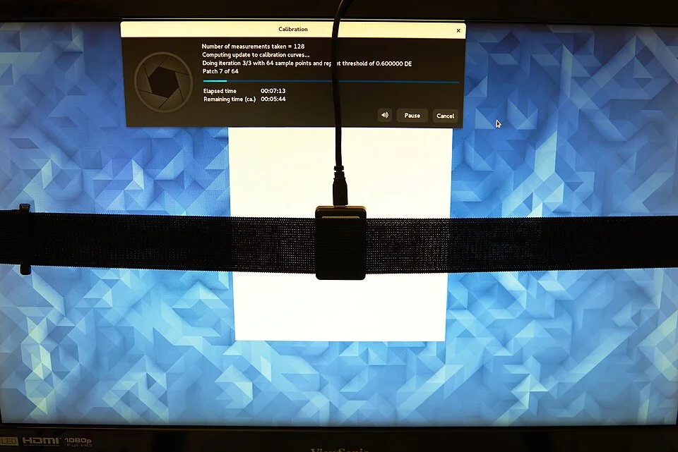
Connecting a small instrument to the face of a monitor looks like a direct way to resolve that disagreement. In the cover photograph a ColorHug2 colorimeter is positioned on the display for a measurement. The instrument helps software observe what happens when it tells the monitor to show test colors. There are two things it can make possible: checking or adjusting how the display behaves, and describing the resulting behavior so a program can translate colors for it. Plenty of everyday confusion comes from calling both of these things calibration.
Calibration gives you a state to return to
You could begin by preparing the same monitor for two different jobs. One needs a bright display in daylight. The other involves comparing photographs in a stable dim space. The appropriate target may differ. What counts as a sensible calibration depends on the purpose and the conditions under which you can use it. The International Color Consortium’s guidance discusses choices such as the display’s white point and luminance. To calibrate is to bring the system nearer a defined working state, possibly using display controls, hardware settings or software adjustments depending on the equipment.
This is an actual change in what the display does. Altering the brightness control noticeably changes the light output. Other adjustments can change the relation between requested and produced tones. A flat gray may take on a different tone in the middle of the range even if you think the white looked comparable before. For work that will be repeated, record which preset was active and any other choices that alter the result. A display that switches into a different mode later can leave a careful measurement describing a state the display is no longer in.
An instrument helps separate adjustment from an observer’s adaptation to the view. A person spending an hour under a warm desk lamp can begin to experience a great deal of the room as relatively neutral. Take them into a different light and the reference changes. Place a measuring device at the screen to judge patches under an appropriate setup and you can collect a record of light from a specific site. That record is not a perfect substitute for observing the image in use. It makes it easier to know whether a change happened in the display, in the conditions for seeing it, or in both.
A profile describes a relationship
Suppose the monitor has reached a useful state. Measurement software can display a sequence of colors and record how the screen responds. A profile can describe the relationship between the device’s values and a shared representation of color. Other software can then use that description when translating an image for the monitor. What is stored in a profile is not a promise that every display with that file will become the same. The file is primarily useful because it describes the response of a particular display or modeled condition. Swap it onto a different display and there is no guarantee it describes what the other one does.
A document can also identify the color space in which its numbers were intended. The triples assigned to a saturated area have a meaning through that description, as well as a numeric form. An application doing color management can interpret the source using this information and work out related device values using the profile for the destination. If it assumes a different source description or bypasses management, the same data may get a different interpretation. A profile cannot do its job merely by existing somewhere on a disk. The application and system need to use the right information where it is meant to be used.
It is often easier to isolate the issue in a small test. Choose a trusted sample image with a known profile, show it in the program that matters to you and note the appearance in a known monitor mode. Open the same sample in another program without changing the monitor. If there is a discrepancy, you have a reason to examine how the applications interpret color, not an immediate reason to buy a display. If the difference appears only after changing modes, look at which display description and calibration are associated with that mode. One variable at a time produces a comparison you can return to.
The device still has limits
There are colors a given display cannot make even if it has a very good profile. Its available range is a physical fact about the equipment and mode. An application may substitute or map a color into the available range according to the way color management is set up. A green losing some saturation because it lies outside the display’s reach is different from a broad color cast caused by using a completely different profile. In both cases the screen can look unlike a reference. The point of a controlled comparison is to be able to describe where and how it differs.
Take a single sample showing a gentle sequence from dull to vivid greens. If a part close to the vivid end collapses to a look that is much the same across several values, ask which system identified or converted the image and what the display can reproduce. A smooth change of tones may do something different on a more capable or differently configured display. Now look at a neutral patch. If everything neutral has changed as well, there may be an additional factor at work. You can notice the pattern before you are in a position to name what caused it.
The instrument is subject to conditions too. Different screen technologies produce colors using different light spectra, and the measuring system should be appropriate for that output and setup. A colorimeter’s filters and the software’s treatment of the readings have their own limitations. Position and incident light can matter to the test. Follow the maker’s guidance and the intended workflow, and document uncertainties if exact agreement is important. Declaring a display measured is far easier than showing which properties were checked under conditions relevant to the intended use.
A laptop connected to a larger monitor makes the assignment problem easy to check. Put the same color-managed window entirely on the internal display, then entirely on the external one. They each need the profile that belongs to them, and the operating system or application has to know which one currently holds the image. Do not leave the window straddling their boundary while trying to test a very precise observation. That can be a different situation for how an application chooses its output.
If you replace one monitor with a different model, keep a record of which identifier and settings went with the old profile. A good descriptive name makes it less tempting to carry the earlier calibration forward accidentally.
The test that comes after the adjustments
In an accurate comparison there is room to check a result against colors other than the ones that fitted the original correction. You might record which set of patches was used to characterize the display and which independent checks were made afterward. Store a date and a note of the display mode with the profile. Once someone changes a setting for better visibility at a presentation, the old description may need to be restored or checked before doing work under its assumptions again. Changes to nothing more than the surround of the display can affect a person’s judgment, even if the resulting light measured at a patch is the same.
Two monitors in different locations present a practical limit to claims of agreement. A shared color workflow can give compatible programs good information about both devices. It cannot decide how much sunlight comes through the other office’s window or whether everybody is in a standard mode. The useful result may be more limited and more achievable: two files that carry the same color description, and two setups in which the most important discrepancies have been measured instead of guessed about. Such a result gives people something to investigate when their impressions differ again.
Return to the pale wall in the photograph. Compare it with a known neutral and pay attention to where the warm cast appears. If it only belongs to the wall in the source, the people adjusting their monitors have a reason to keep it. If the neutral reference is also strongly different, they can investigate the application, screen and room before asking the photographer to change the file. The little instrument at the face of the screen helps put one of those things into a record. That is often all it needs to do to make the next conversation much easier.