The Blank Border Around a QR Code
A square code can survive some damaged data and still fail on a shiny sign. The difference lies in the work a reader does before it can recover the message.
In this story 5 sections
A sign looks sharp from the pavement. Point a phone at it and a link appears. Now imagine the same squares set flush against the border of a photograph. The contents of the grid do not change, but the reader might have more trouble finding where the grid ends. It is easy to spend a morning checking the web address when the problem belongs to the space around the picture.
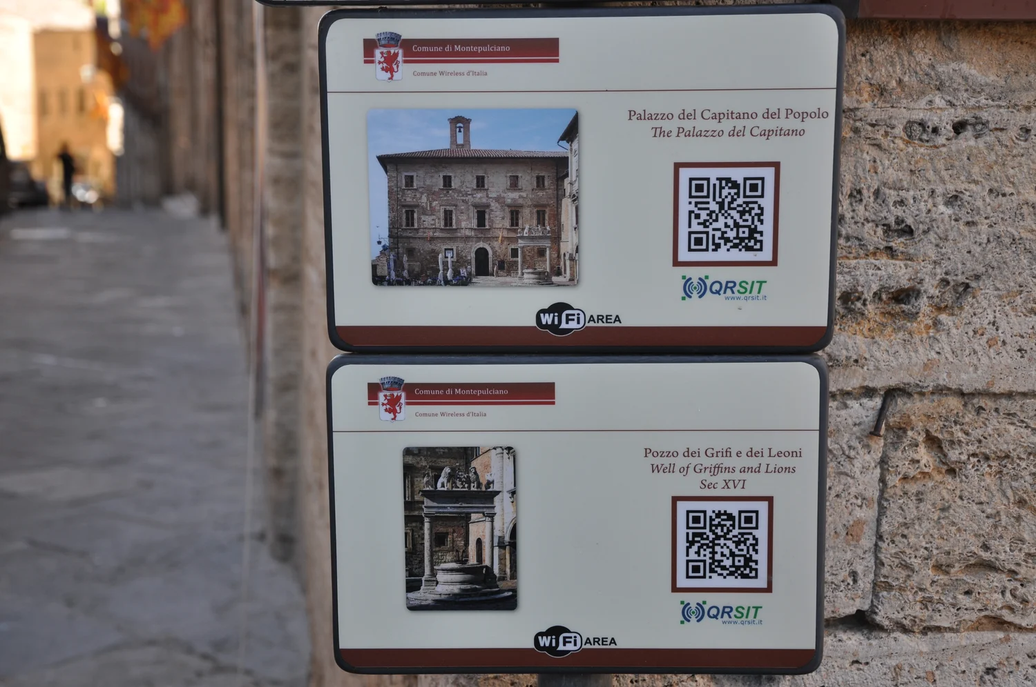
The QR signs in the cover photograph show a modest piece of design. The squares sit in an area of their own on each plaque, apart from the building photograph and the printed text. The web address is only one part of the service. Before opening anything, a camera and its software have to take account of angle, detail and the margin someone decided to set around a very small square. The lighter area can be as useful as some of the dark ink.
A puzzle a camera has to find before solving
Imagine a phone looking at an exhibition label at an angle. At first it has only an image of the scene, perhaps including two plaques, the surface behind them and somebody's moving sleeve. It needs to locate a code and make sense of the angle before trying to read its modules. Modules are the small square units that give the code its light and dark pattern. Even if the original image was a square, the perspective view in the camera need not look like a square of equal sides and right angles.
Ordinary QR Codes use three conspicuous position detection patterns near the corners. Those repeating forms are part of the symbol and give a reader evidence about where it lies and which way it is facing. The empty area around the symbol supplies different information. It gives the first line of code a visual boundary. If a dark line from an adjacent graphic runs into the grid or an ornamental frame comes too close, the camera does not know that a graphic designer considered it separate.
DENSO WAVE's layout guidance gives a clear margin of four modules on each side for standard QR Code symbols. Here a module is a unit taken from the code itself. If the little squares are one millimetre each, the margin is four millimetres wide along each edge. If each is half a millimetre, the margin is two millimetres. Defining it in modules makes the requirement move with the print size. A fixed border in a design template can be ample for one code and too narrow for another.
The grid that gets denser
The number of modules across a square is related to the version of the code. A bigger grid can represent more information with the appropriate encoding and settings. That is separate from how large you print it. Suppose a sign maker wants to fit two hypothetical designs into identical sixty millimetre spaces. A grid twenty one modules wide and its margins make a total of twenty nine modules across. A twenty nine module grid with the same required margins makes thirty seven. Fitted to the same space, the second has smaller marks. It can carry more data and still be the harder one to photograph from the pavement.
That difference is useful when people ask for more information in the symbol without wanting to change the sign. A long link, another data field or more correction can require room. Fitting the denser code into the previous allotment may run into the practical limits of focus, printed ink and the viewing distance. Printing the same denser grid larger is another decision. It preserves more room for each detail if the surface has space.
Some print problems are choices about how the artwork moves from one size to the next. Resampling a tiny bitmap by an awkward ratio can give the edges of individual squares intermediate colours. Printing minute details on absorbent stock can spread ink across the gaps. Starting with clean artwork and checking the output in the form people actually see avoids an argument about whether a perfect digital original was enough. Tests should include the border, any surrounding text and the final print substrate.
Recovering a message after a damaged patch
Error correction puts additional information into a code so that some damage need not make the original data disappear. DENSO WAVE describes using Reed–Solomon coding for this part. There are different correction levels. Raising the level spends more space on recovery information for a given payload. That can suit a label likely to become dirty, but the answer also depends on the finished footprint. More internal redundancy does not improve a photograph that has blurred all its marks together.
A familiar misunderstanding is to take a percentage associated with a correction level and turn it into the fraction of any picture you can safely cover. The published figures refer to a share of codewords, not a guarantee about damage to any square patch in the printed image. A mark in a particular location can make it harder to locate or interpret the symbol. Glare across a broad area may remove useful features while a physically smaller scratch in another place is tolerated. The shape and location of the damage matter alongside its size.
It is helpful to distinguish four questions. Can the device detect the symbol? Can it establish a usable grid? Can it recover the message? Can the next program do something with that message? A link that opens to a missing web page has passed the stages involved in recovering the link. A camera that searches without presenting anything may never have reached the error correction stage. Troubleshooting makes more progress when it starts with the observed symptom rather than the fact that the end goal failed.
Where the phone really has to stand
Poor placement can cause a working label to fail for a particular group of visitors. A plaque beside a doorway may be easy to photograph straight on when the room is empty. A table underneath can move the nearest viewing point farther away. A plaque behind glass might need a slight change of angle during the time of day a window is bright. There is no single printing dimension that can describe all those conditions, even though a designer can start with reliable layout guidance.
One useful test is to approach the final sign as a new visitor would. Begin with the usual line of sight, leave neighbouring labels in place and see whether the camera can pick up the intended code without leaning around a barrier. Try a few display sizes or camera distances if the code will be seen on screens as well as paper. Record which change matters: a wider margin, a larger print, less reflection or an easier place to stand. That gives the sign maker something more useful than worked for me written beside a small copy in a design file.
Test the action after scanning as well. If the message is a web address, confirm that its destination is the one promised by the label. A page that has moved needs a maintained address or a corrected sign. An explanatory line such as Read about this building tells the visitor more than Scan here. Showing an intelligible short address or keeping essential directions in plain text gives people an alternative when they cannot use the camera. The visible promise matters to the reader whether the display is every bit as sharp as the designer intended.
Which part to change first
On a screen, the border can disappear during a design change that leaves the image file intact. Suppose a page uses a square thumbnail frame and crops its contents to fill the frame. The original artwork may include a correct margin, but the visible version may have little or none, especially when the photo around it has different proportions. Check the actual page at narrow widths. A successful scan from the designer's full size export tells you nothing about a version clipped by the page.
Imagine a gallery test in which one visitor presents the phone directly to a plaque with no success. The printer has provided an excellent sample of the same code on a loose sheet, and the sheet works while the wall plaque does not. That is a reason to compare conditions before changing encoding settings. Check the size of the printed modules, the surrounding design, the lighting and whether the sheet can be viewed at a shorter distance. The same message appearing in two places does not make the two places equivalent.
Run the comparison in the other direction as well. A plaque may reliably give readers an address that no longer works. Making the artwork larger will not bring back the page. Verify the decoded text and the destination independently. If the code printed to a batch of labels needs to stay put for several years, think about who can update the linked resource over that period. A technically readable square anchored to a forgotten temporary page can soon become a reliable route to a dead end.
The quiet area is a small argument for leaving room on a sign. It is space that does active work without supplying a single letter of the message. A viewer may never notice it, just as they seldom see the corrections a scanner performs. Keeping the sign legible requires care for both: enough clear space to locate the pattern, and enough of the pattern left to understand what it says.